Viaplay
Enabling users to always find what they are looking for
Summary
At Viaplay I was the sole designer in the navigation team called team Gravity. Together we made strategic enhancements across Viaplay's platforms, optimizing navigation elements and content exploration. Through meticulous design iterations and user-focused improvements, we managed to significantly boost user engagement metrics while ensuring a seamless and intuitive user experience for the 7.5 million Viaplay subscribers.
My role:
Product designer, driver of the design system
Team:
Agile product team, design guild
Client:
Viaplay
Date:
May 2022
My approach
I tackled challenges at Viaplay by leaning on an Agile UX methodology, emphasizing iterative design, collaborative teamwork, and data-driven decision-making to optimize the user experience of the product.
Deliveries:
Tools:
Figma, Figjam, Miro, Hotjar, Maze, JIRA
Introduction
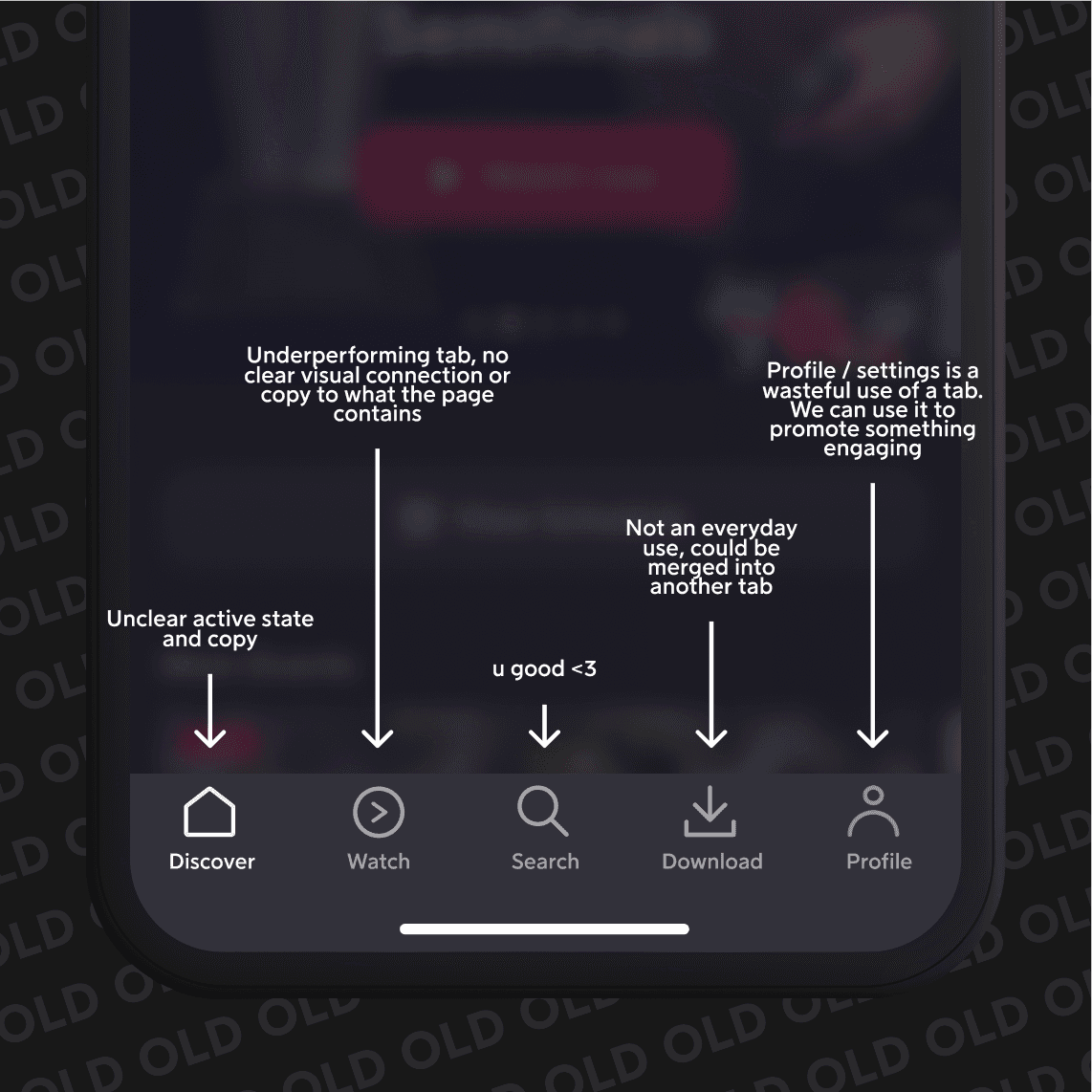
When I joined Viaplay in 2021, the Gravity team was in need of a dedicated designer. Previously, there had been a gap in design support, and the previous designer had a preference for conceptual UI work rather than addressing the navigation challenges. Consequently, the app's navigation system was in a suboptimal state, lacking clarity and user-friendly elements. As the sole designer within the Gravity team, my mission was to overhaul Viaplay's navigation and content exploration. Tasked with improving the user experience across platforms, my focus was on implementing Agile UX methodologies to refine app navigation and streamline content accessibility. Together we created an overarching problem statement and KPIs to meassure success.
Problem statement
"How might we streamline Viaplay's navigation system so that users can effortlessly explore content and enjoy a seamless and intuitive viewing experience?" We will measure our success based on increased playrate and our new KPI, findability rate, which we strive to push to over 70% across all platforms.
Optimizing the navigation
Actors and directors
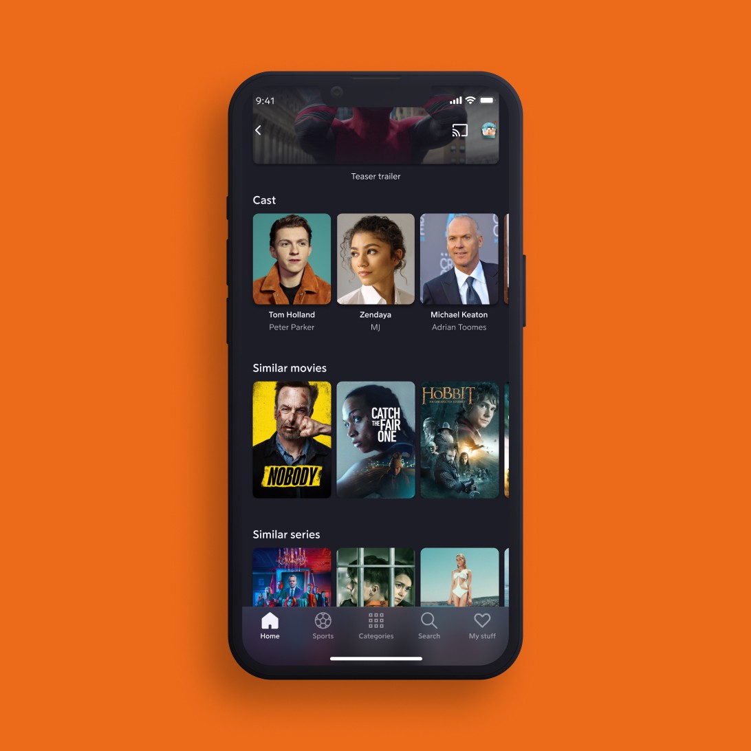
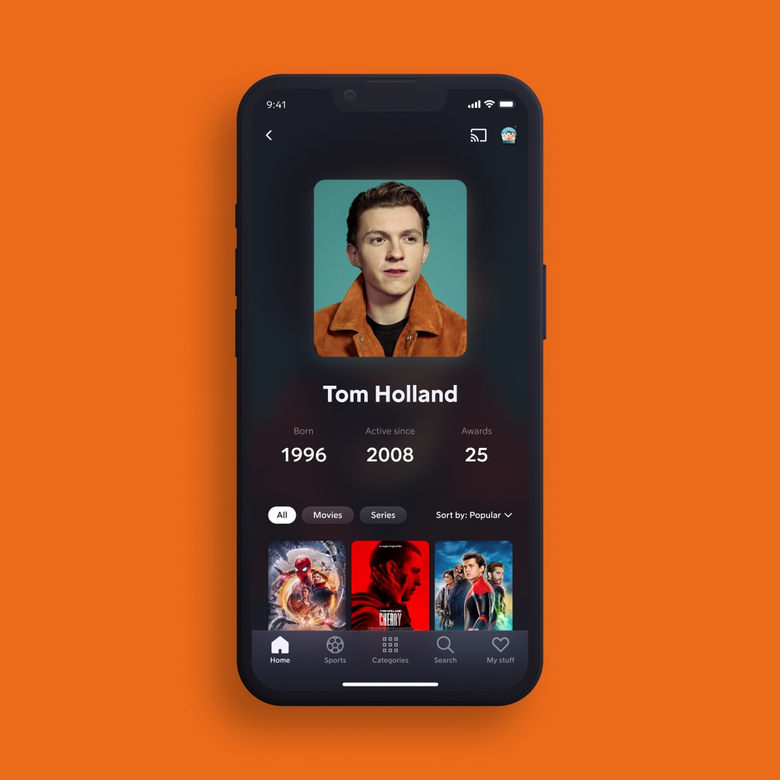
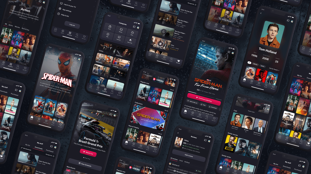
One of our big breakthroughs when trying to understand our user needs came from insights that showcased a desire to explore content based on specific actors and directors. After in-depth competitor analysis, analyzing existent data and brainstorming sessions, we devised a user-friendly actor page, allowing users to delve deeper into their favorite artists' works. Through A/B testing the people block we saw that the card version of the page led to a remarkable 16% spike in product page engagement.
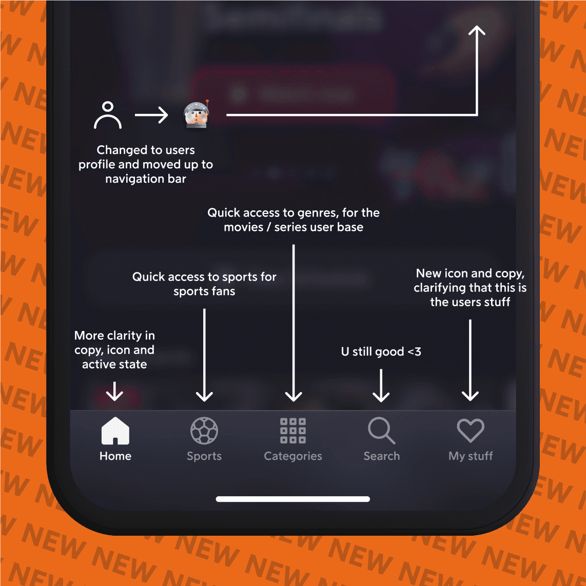
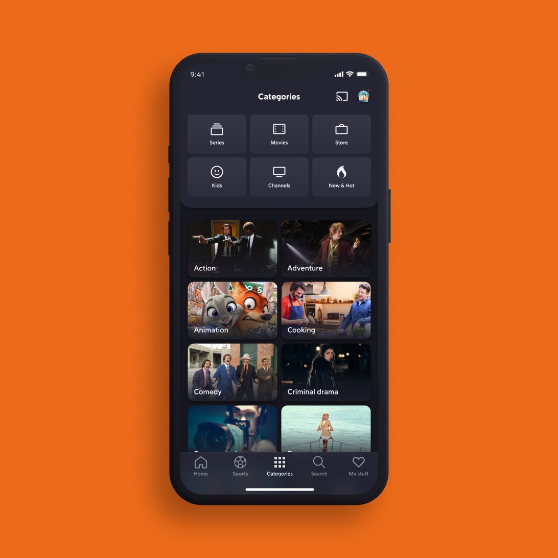
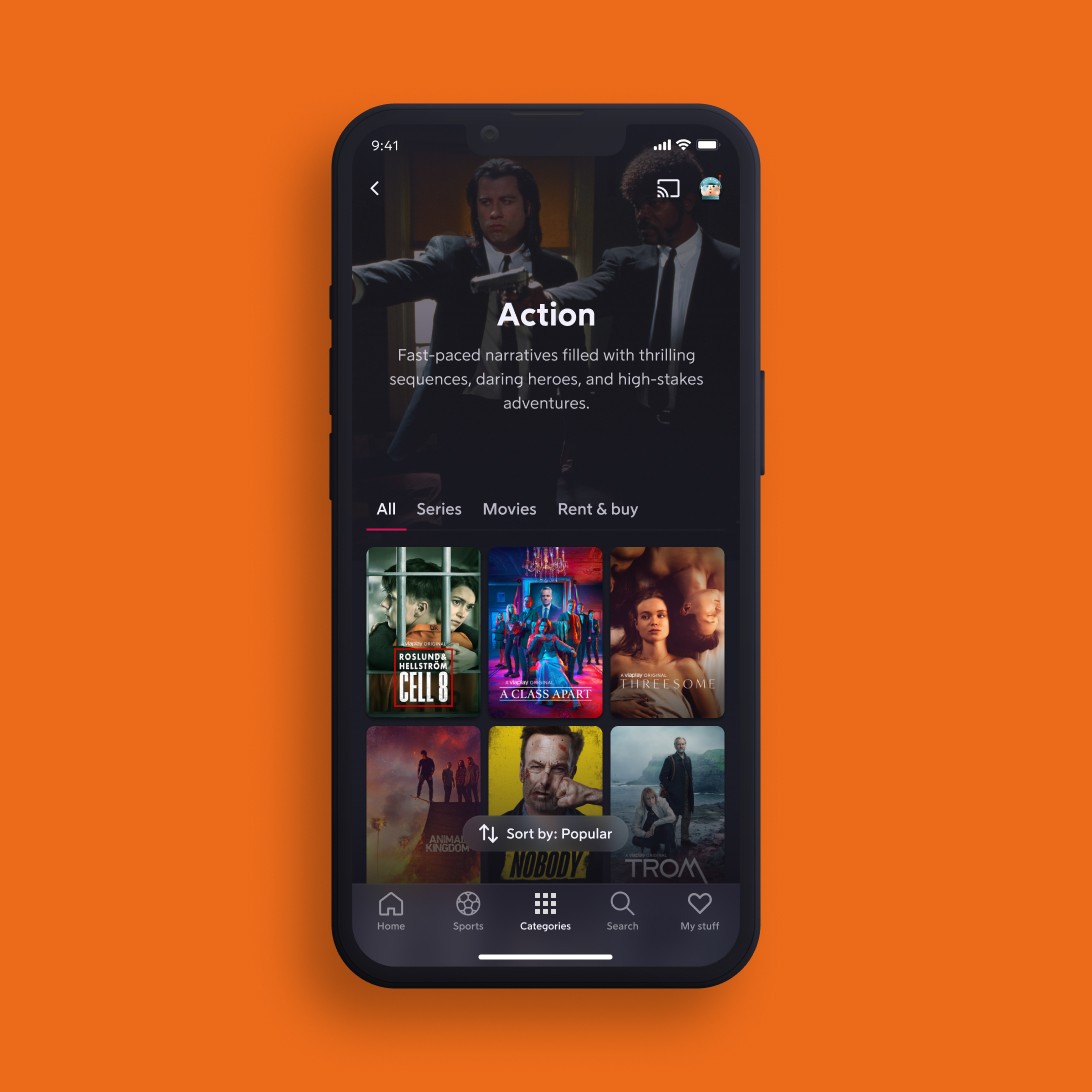
Category Navigation Overhaul
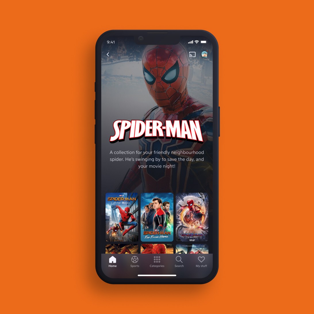
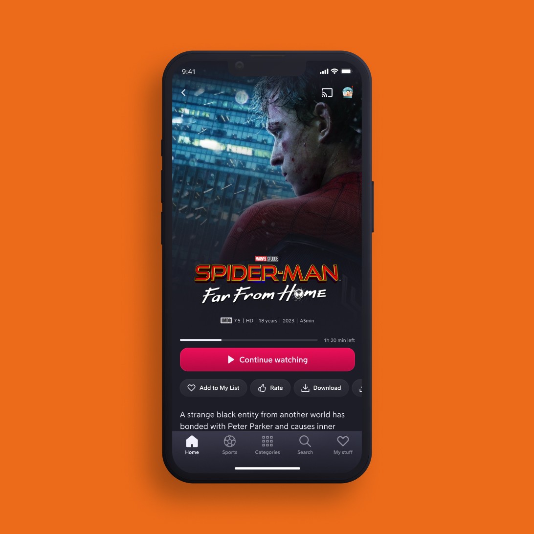
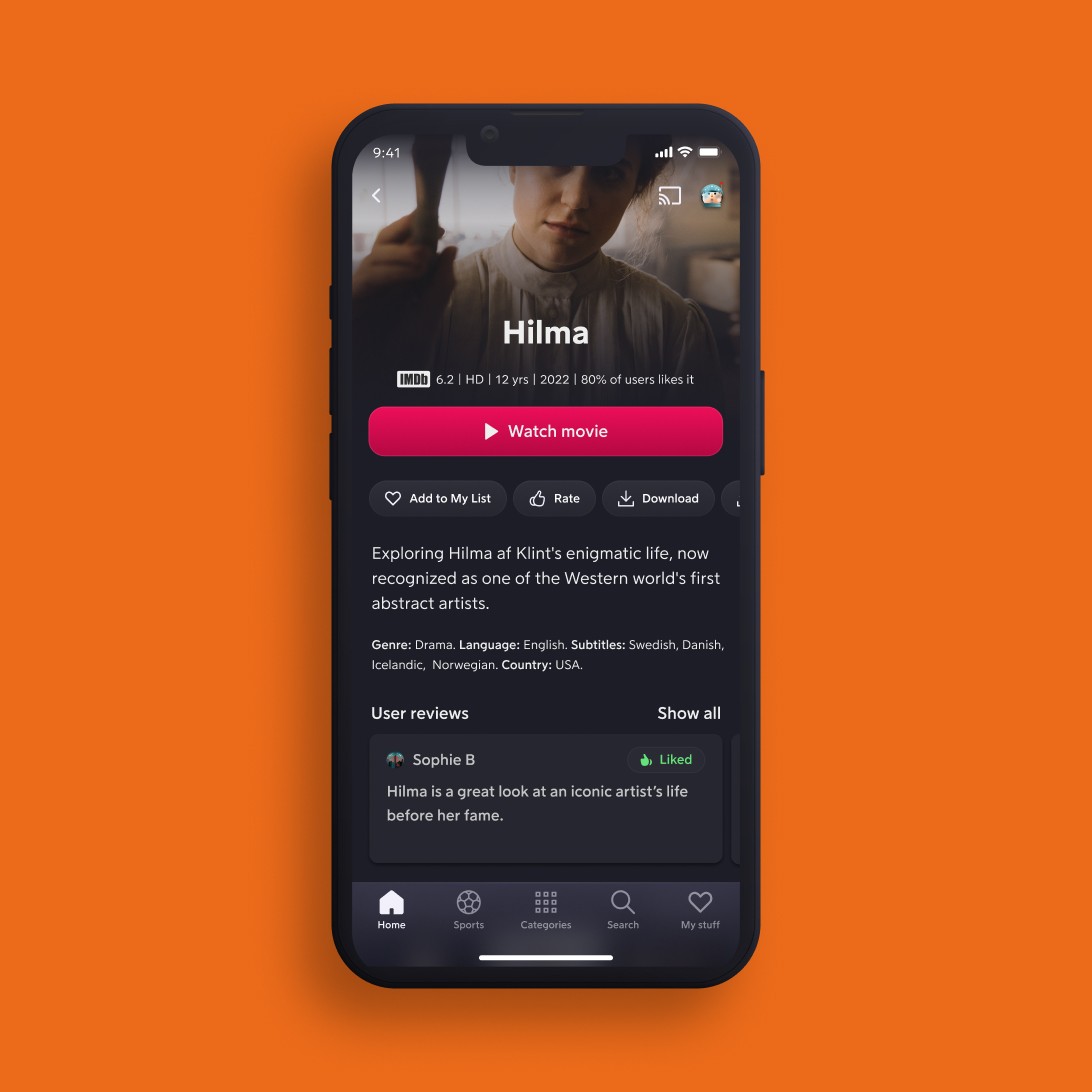
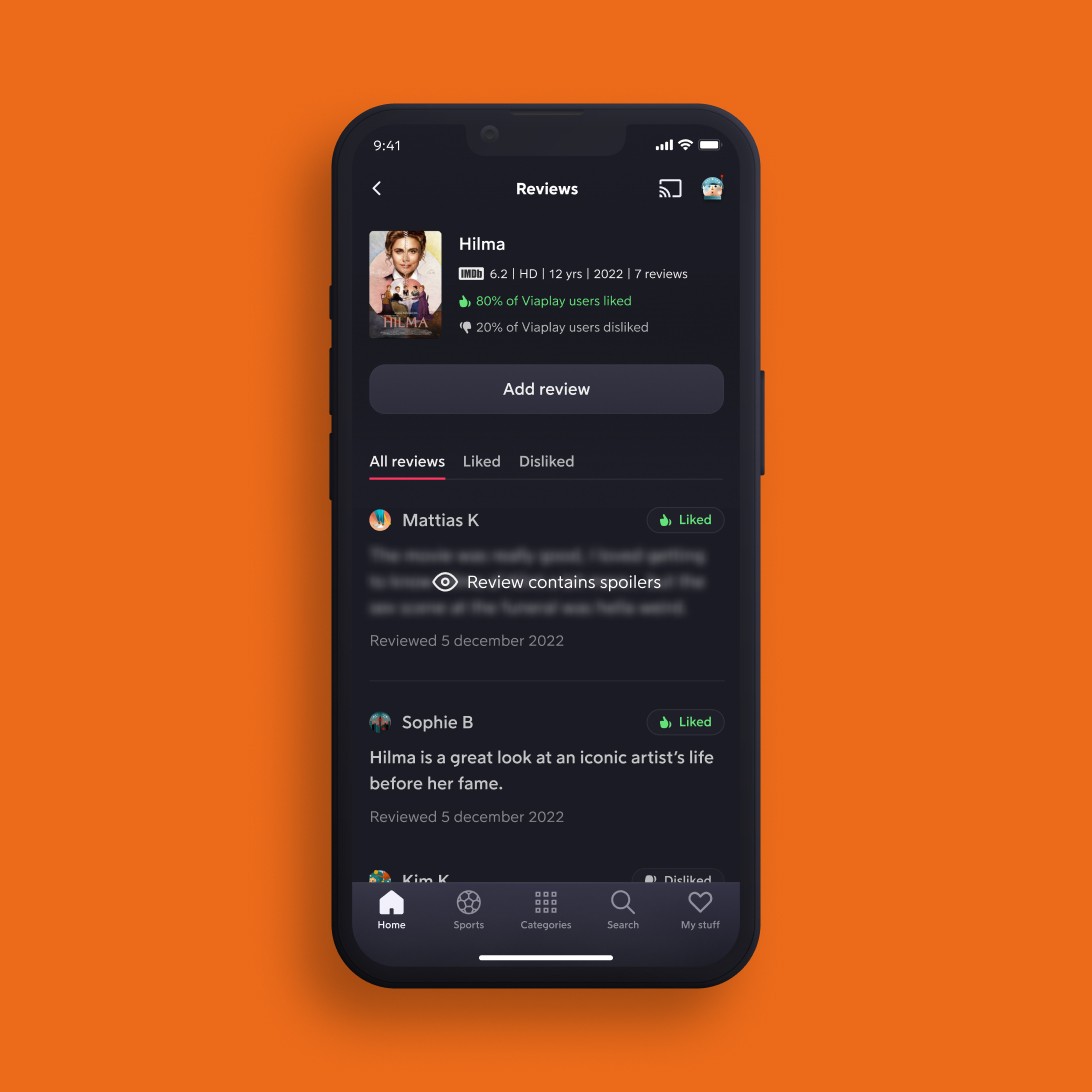
Universe and product page re-design
Testing early is key, I knew that already but still. We have saved so much development time and brain power by narrowing down our concepts before digging in to the tech.
I thrive in fast moving cross-functional teams. Seeing the impact that we have on the product is awesome!
I like to be all over the place and help out as much as I can wherever I can. It’s fun and allows me to grow as a designer, I just really need to be mindful that my focus stays on the prioritized target.
Now it's time for some SHOTS!
